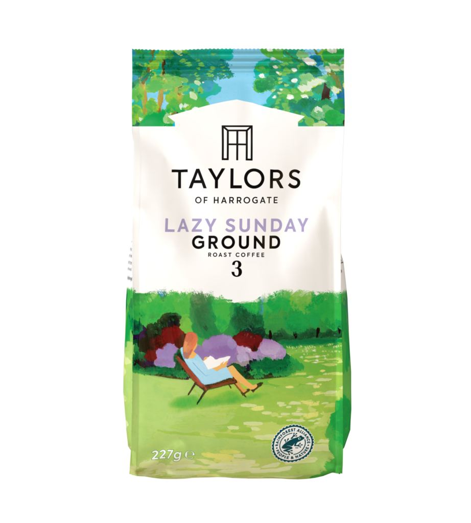
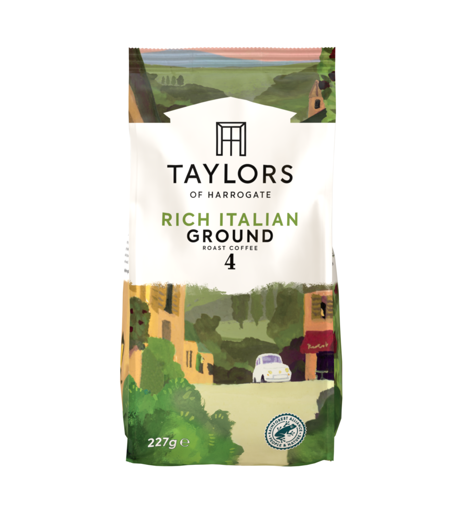
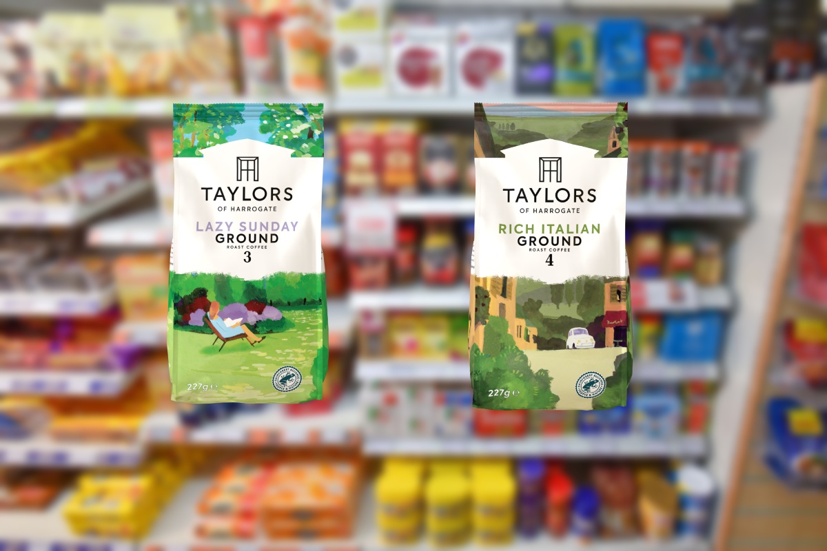
Taylors of Harrogate has redesigned its coffee packaging, with a key focus on the brand’s heritage, to drive stand out on shelf and make it easier for consumers to purchase from the category.
The new design is available now on the brand’s Lazy Sunday and Rich Italian ground variaties through all major wholesalers, and includes a new logo, colour variation to differentiate between ground and beans, and simplified messaging.


Designed to be distinctive and unique, the logo now has a “roof profile”, which is a nod to the origins of the Taylors brand, according to the supplier.
Kelly Wright, senior brand manager at Taylors of Harrogate, said: “Taylors knew the back of pack guides had a big part to play in simplifying the world of roast and ground coffee. To do this, the measurements – which are now in ‘spoons’ rather than grams – language, copy and icons were simplified to form easy-to-follow step-by-step guides.
“While much of the packaging has been updated, the illustrations which have been synonymous with the brand’s most popular lines, like Lazy Sunday and Hot Lava Java have remained on pack.”
Read more product news


Comments
This article doesn't have any comments yet, be the first!