Kay Patel
- Location: Stratford, east London
- Store size: 2,000 sq ft, large convenience
- Been in the business: 23 years
- Customers: students, Polish, pensioners and affluent young
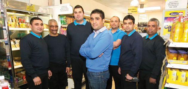
Since Kay Patel took over his 2,000 sq ft store near Stratford town centre he has quadrupled it in size and added an off-licence, changing it from a newsagent to large convenience store. The store serves a lot of college students and there are many fast food shops and a university nearby. Around 10% of the store’s sales come from Polish people and pensioners and the number of young, affluent customers is growing. Beer and grocery are Kay’s best sellers in the evening and snacks and confectionery in the day.
Before
Confectionery
- Large volumes of bagged confectionery sold.
- Confectionery displayed on main fixture mid store, away from till.
- Display “messy”, according to Kay, and in need of re-planogramming.
Crisps & Snacks
- Stock bought from van supplies.
- Crisps and snacks displayed on fixture beneath large, wide counter.
- Promotions work well, but range contains too many flavours.
Soft Drinks
- Displayed on main fixture beyond counter, halfway down store.
- Display based on two planograms and advice from Bestway.
- Best sellers include energy drinks, with several new products in stock.
Category Advice
Mars: Confectionery
- Create a secondary display of best selling confectionery lines in an area immediately left of the tills.
- Merchandise an area near to beers, wines and spirits with best selling bitesized pouches.
- Create interest in-store with themed areas to tie in with seasonal and calendar events.
- Use planograms to ensure the correct confectionery products are in stock and in the correct places.
PepsiCo: Crisps & Snacks
- Relay the fixture to ease shopping, optimising range and focusing on best sellers.
- Place a slim stand by sandwiches containing Walkers standard bags to encourage link purchases and meal deals.
- Place clipstrips holding sharing bags by wines to cater for entertaining at home and to encourage link purchases.
- Introduce full range of Flavour Cup products with PoS to capitalise on consumer awareness around this campaign.
GSK: Soft Drinks
- Group like products together and give more facings to top selling products.
- Tighten up vertical blocking.
- Implement a needstates flow to make it easy to find products.
- Reduce facings on slow selling lines.
Results
Confectionery
- Permanent addition of a new confectionery display that encourages impulse sales.
- Customers buying more chocolate on impulse, including regulars who used to miss the main display.
- Increased sales of higher margin chocolate products.
- Average confectionery retail sales value up 12%
Crisps & Snacks
- Approximately £1,500 additional crisps and snacks sales in total during project period.
- Triple siting of limited edition Flavour Cup range produced strong sales, with frequent refills of baskets necessary.
- Permanent addition of a “take home” shelf linked to beer and soft drinks.
- Increased sales, linked purchases and awareness of snacks range by placing crisps by the chiller.
Soft Drinks
- Sales increase of 44% versus the market.
- Clearer display of products easing shopping for a very diverse customer base.
- Sales increases of up to 9.6% on products where facings were reduced.
- Strong performance from energy drinks in particular, after improved display.


Comments
This article doesn't have any comments yet, be the first!