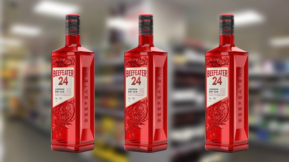
Beefeater 24 has launched a new pack design, which supplier Pernod Ricard says reflects the 24-hour energy of its home of London.
The redesign retains the bottle’s red glass, but is more sustainable, with 90% less plastic on the closure and back label, 30% less aluminium and 22% less glass.
Pernod Ricard to distribute Sovereign Brands’ premium wines and spirits
It is also now taller to stand out more on shelf.
Additionally, Pernod Ricard says the bottle has a better grip, thanks to the adoption of the brick shape on the side of the bottle. Its label is sliced at a 24-degree angle to represent the 24-hour steeping of the botanicals.
Read more product news


Comments
This article doesn't have any comments yet, be the first!