Steve Denham revisits Avtar (Sid) and Sukhi Sidhu’s Simply Fresh Kenilworth store to see how they created a family shopping experience
I recently revisited Avtar (Sid) and Sukhi Sidhu’s Simply Fresh store in Kenilworth. When I looked at their store in July, they had started to change their layout and merchandising as they reacted to what they had learned in the first eight months of trading in their enlarged business.
Over the next few weeks we will be revealing some of the new ideas and changes they have implemented. As Sid says: “It’s about the mission”.
Their mission is to understand their customers, and make it easier for them to spend more.
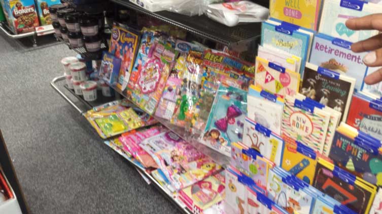
Sid and Sukhi have a young family, and personal experience of the challenge that a shopping trip can bring to parents. They have taken account of children in the changes they have made to their merchandising plan. They have brought most of the kid’s products into one area of the store, and now have children’s comics/magazines alongside sweets and carton drinks in one zone.
They have even overcome the problem that low shelving can cause by displaying these products at that level which is much closer to ‘child’s eye-level’.

The proof of success with this strategy is a rewarding 20% increase in children’s magazines sales since separating them from the rest of the magazine category.
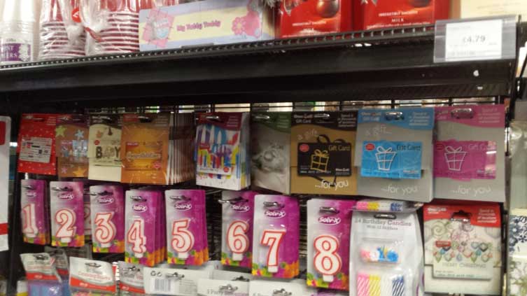
Also in this area is a one-metre rack of greetings cards. To leverage associated extra sales from greetings card customers there are boxed chocolates and other gifting products displayed on the adjacent bay. The other side of the card display, above the kids magazines, is a range of partyware from paper plates to number candles. Sid has also brought his Post Office Gift Card range out from behind the counter and is displaying them in this area.
For kids and adults Sid and Sukhi are certainly helping with this shopping mission.


Comments
This article doesn't have any comments yet, be the first!