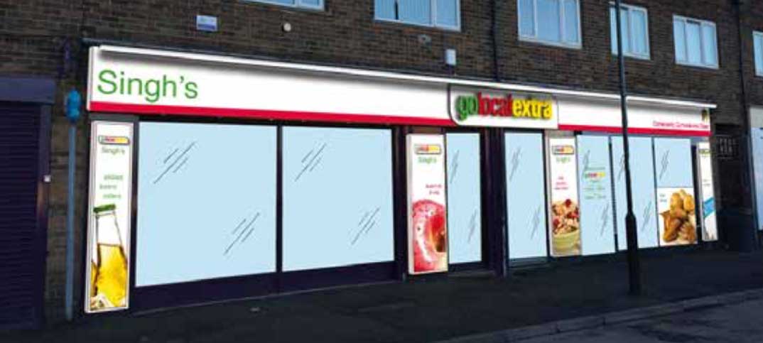
It has been seven years since our last major refit and our customers’ needs and shopping habits have changed greatly.
Since Asda opened one of their superstores less than a mile from our shop its weaknesses have been exposed. The rise of Aldi and Lidl has also exposed the weaknesses in the four major supermarkets big box model of retailing.
A new look
When my wife Mandeep and I started to talk about how we wanted our new extended store to look like we knew that we wanted it to look very different from what we already had. We didn’t want a bigger version of our 2008 design. I have looked at Go Local Extra, Family Shopper, Aldi and Lidl stores as well as Asda and the other supermarkets while searching for our store of the future.
 Jai’s first floor plan. Click to enlarge.
This was the first plan drawn up last October. It was a fairly standard convenience design that used the new space reasonably well, but it didn’t deliver the vision for the store that I had my head.
Meeting customers’ needs
I have spent a lot of time talking to customers about their shopping habits and how they and their families are meeting the challenges of the changed economic environment. A feature in many of these conversations has been that they are using much more frozen food, so this category will need a bigger presence.
We of course won’t be ignoring the strengths we have in our current product mix. Alcohol, which is one of our strongest categories, will be a feature within the new layout.
I have been experimenting with providing customers with shopping solutions for the past year or so and will be taking what we have learnt into the new layout. So whether it is for on-the-go snacks, family meals or household chores, we are planning to make our customers’ shopping visits easier, and deliver increased basket spends.
Making a statement
Mandeep and I want to develop a store that stands out on Wheeta Road with as much of a clear glass store front as we can have installed. We want anyone who comes by the store to see an open invitation for them to come inside. The island fixtures are going to be the traditional low level to enable the whole store to be seen from outside.
One of the most significant changes from our old store model is to introduce 5 meter bays of non-food items, all blocked together on one aisle. We will be sourcing this from OTL and the range will include household products, pet treats, toys and stationery.
With it being 5 metres, I intend the range to make a statement about our renewed store and value proposition.
 The final plan. Click to enlarge.
Our final plan features nearly all the ideas that I had for our new store.


Comments
This article doesn't have any comments yet, be the first!